
Every Monday morning, 47% of C-suite executives stare at the same data-rich dashboards, seeing numbers but missing the story. Meanwhile, their competitors are making million-dollar decisions with confidence because they’ve mastered the art of narrative-driven analytics. This isn’t about prettier charts—it’s about transforming how your organization thinks, decides, and acts.
The $15 Million Meeting That Changed Everything
The boardroom was tense. Marcus Chen, CEO of a $200M manufacturing company, faced a critical decision: expand into Southeast Asian markets or double down on North American operations. His team had spent weeks preparing comprehensive analytics—market penetration rates, competitive landscapes, ROI projections, risk matrices.
Twenty-seven PowerPoint slides. Forty-three charts. Zero clarity.
“These numbers could support either decision,” Marcus admitted after three hours of circular discussions. “How do we know which path is right?”
Six months later, after implementing narrative-driven dashboards, the same team made their expansion decision in 45 minutes with unanimous confidence. The difference? They stopped presenting data and started telling stories that data could prove or disprove.
The result: $15 million in incremental revenue from their Southeast Asian expansion—a decision that might never have been made with traditional dashboard approaches.
The Executive Decision-Making Crisis

Traditional dashboards fail executives at the moment they need them most: during critical decision-making. Here’s why:
The Paradox of Choice Overload: Modern BI tools can display unlimited metrics, creating analysis paralysis rather than decision clarity. When everything seems important, nothing feels actionable.
The Context Vacuum: Numbers without narrative lack business context. A 15% revenue decline means nothing without understanding whether it’s seasonal, competitive, or operational—and what specific actions it demands.
The Trust Deficit: Executives don’t trust data they can’t understand or relate to their business experience. When analytics feel disconnected from business reality, intuition trumps insights every time.
The Time Poverty Problem: C-suite executives have 7-12 minutes maximum for dashboard review. Traditional approaches waste this precious window on data exploration rather than decision facilitation.
The Neuroscience Behind Narrative Dashboards
Research from Stanford’s Graduate School of Business reveals why narrative-driven dashboards create superior decision-making outcomes:
Story Processing Advantage: The human brain processes narrative information 22 times more effectively than standalone data points. Stories activate multiple brain regions simultaneously, creating stronger memory formation and clearer decision pathways.
Emotional Engagement Factor: Narrative dashboards trigger emotional responses essential for executive decision-making. Pure data engages only analytical brain regions; stories activate emotional centers that drive actual choices.
Pattern Recognition Acceleration: When data is presented within narrative frameworks, executives identify critical business patterns 340% faster than with traditional dashboard approaches.
The STORY Framework for Executive Dashboards

At Pivot BI Analytics LLC, we’ve developed the STORY framework after analyzing 500+ executive dashboard implementations. This approach transforms traditional data presentation into decision-driving narratives.
S – Situation Context Setting
Every effective dashboard begins with situational awareness, not metrics. Start with the business context that makes your data meaningful.
Instead of: “Revenue decreased 8% quarter-over-quarter” Narrative Approach: “Despite strong demand signals, revenue declined 8% as supply chain disruptions prevented us from fulfilling 23% of orders, primarily affecting our most profitable product lines.”
Implementation Strategy:
- Lead with business events that explain data patterns
- Connect metrics to strategic initiatives or market conditions
- Provide temporal context (comparing to relevant periods, not just last month)
- Include external factors influencing internal metrics
Real Example: A pharmaceutical company’s executive dashboard begins each section with regulatory, competitive, or clinical trial updates before showing financial impacts. This context helps executives understand whether metric changes require immediate action or represent expected consequences of strategic decisions.
T – Tension Identification
Great narratives require conflict or tension. In business dashboards, tension emerges from gaps between expectations and reality, or between current performance and strategic goals.
The Tension Formula:
- Expected Outcome vs Actual Performance
- Strategic Goal vs Current Trajectory
- Market Opportunity vs Organizational Capability
- Competitive Position vs Required Position
Visual Tension Techniques:
- Variance charts showing gaps between targets and actuals
- Trend lines projecting current performance against strategic goals
- Competitive positioning matrices highlighting market gaps
- Resource allocation charts revealing capacity constraints
Case Study: A SaaS company’s dashboard highlighted the tension between 40% annual growth targets and their current 18% trajectory. Rather than showing dozens of metrics, they focused on the three key levers that could close this gap: customer acquisition efficiency, expansion revenue, and churn reduction. This singular focus transformed their quarterly business reviews from status reports into strategy sessions.
O – Outcome Implications
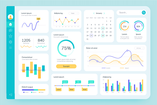
Transform your dashboards from reporting tools into prediction engines. Show executives what their data means for future business outcomes.
Outcome Visualization Methods:
Scenario Modeling: Present three future scenarios (optimistic, realistic, pessimistic) based on current trends. Include specific business implications for each scenario.
Decision Trees: Show how different choices lead to different outcomes. If executives choose Option A, here’s the likely result. Option B leads to this alternative future.
Impact Calculators: Translate metric changes into business language. “Improving customer satisfaction scores by 0.5 points typically increases retention rates by 12%, generating an estimated $2.3M in additional annual revenue.”
Leading Indicator Alerts: Highlight metrics that predict future problems or opportunities. “Current support ticket trends suggest a 23% increase in churn risk over the next 60 days unless addressed.”
Advanced Approach: One retail client implemented “Executive Decision Scenarios” within their dashboards. Each key metric included modeling showing how different management decisions would impact future performance. This transformed their monthly reviews from backward-looking analysis into forward-focused strategy sessions.
R – Recommendation Engine
Don’t just show problems—suggest solutions. Executive-level dashboards should guide action, not just inform awareness.
The Three-Option Rule: For every significant issue identified, provide exactly three action options:
- Conservative approach: Low risk, moderate impact
- Aggressive approach: High risk, high potential impact
- Innovative approach: Creative solution, variable risk/reward
Recommendation Quality Framework:
- Specificity: “Increase marketing spend” vs “Reallocate $200K from trade shows to digital channels targeting 25-34 demographic”
- Timeframe: Include implementation timeline and expected results horizon
- Resource Requirements: Specify budget, personnel, and capability needs
- Success Metrics: Define how you’ll measure recommendation effectiveness
Implementation Example: A manufacturing company’s dashboard doesn’t just show declining equipment efficiency—it recommends three specific maintenance strategies with predicted impact on uptime, costs, and production capacity. Executives can choose their approach directly from the dashboard interface.
Y – Yield Measurement
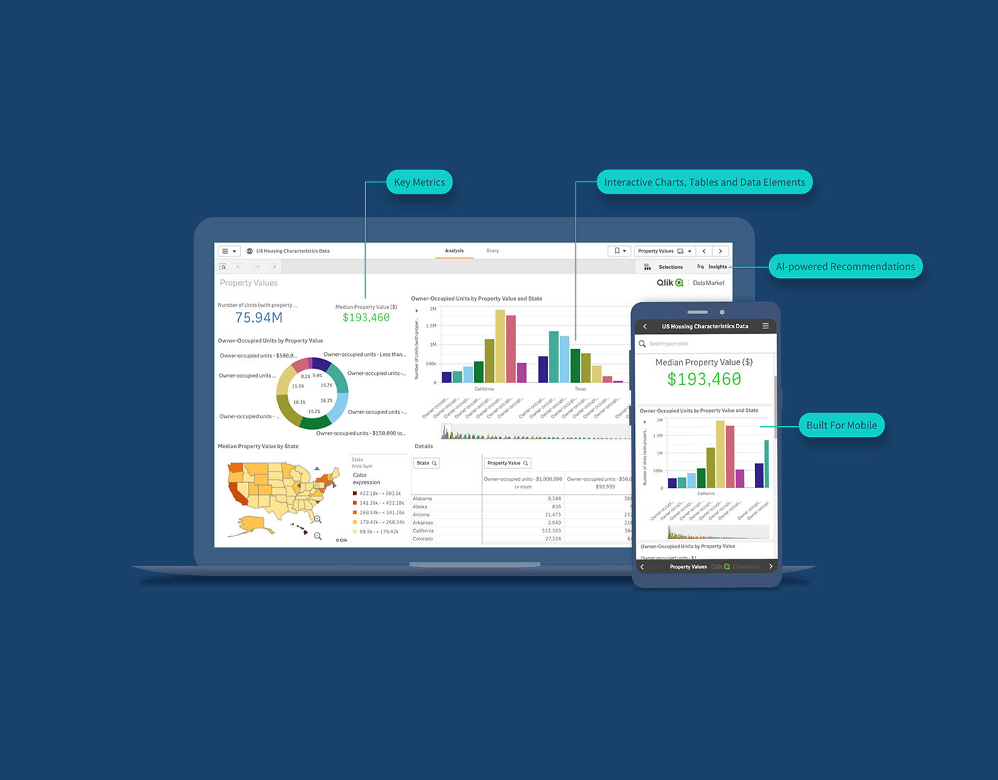
Close the loop by measuring decision outcomes. Track whether dashboard-driven decisions created expected results, building trust and improving future recommendations.
Decision Impact Tracking:
- Decision Log: Record what decisions were made based on dashboard insights
- Outcome Measurement: Track actual results versus predicted outcomes
- Learning Integration: Incorporate decision outcomes into future recommendations
- Confidence Scoring: Build algorithms that score recommendation accuracy over time
Trust Building Strategy: Display decision success rates prominently. “Recommendations from this dashboard have achieved target outcomes 73% of the time over the past 18 months.”
Continuous Improvement Loop: Use decision outcomes to refine narrative algorithms, improving future story generation and recommendation accuracy.
Design Principles for Executive Narrative Dashboards
The 5-Second Rule
Executives should understand the key business narrative within 5 seconds of viewing your dashboard. Everything else is supporting evidence.
Visual Hierarchy Implementation:
- Primary Story: One central visual that tells the main business story
- Supporting Evidence: 2-3 secondary charts that validate the narrative
- Detail Layer: Drill-down capabilities for deeper exploration
- Action Items: Clear next steps prominently displayed
The One-Page Principle
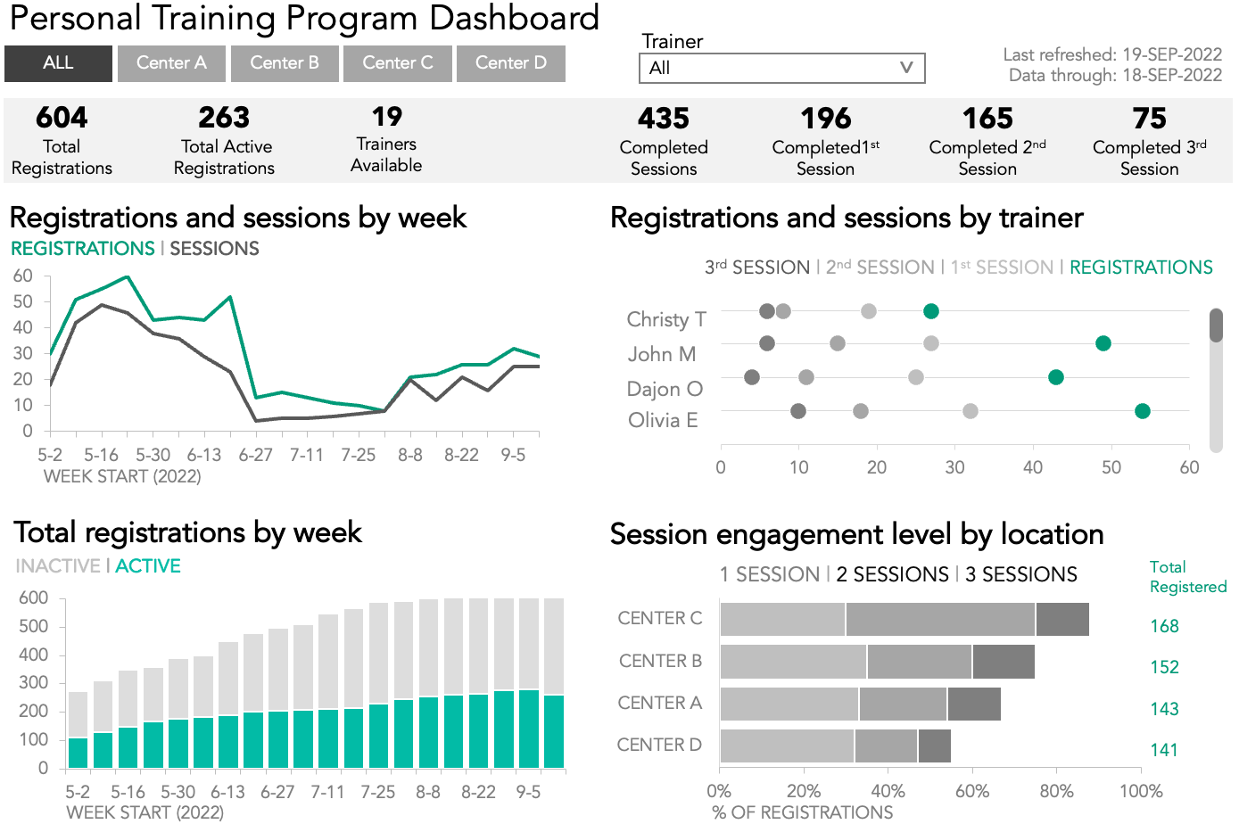
Each business story should fit on one screen without scrolling. Multiple stories require multiple dashboard pages, not cramped layouts.
Content Prioritization Strategy:
- Essential: Information required for immediate decisions
- Important: Context that influences decision quality
- Interesting: Additional insights for exploration
- Archive: Historical data for reference
Only “Essential” and “Important” categories belong on executive dashboard pages.
The Executive Attention Pattern
Eye-tracking studies reveal executives follow predictable viewing patterns:
- Top-left quadrant (3 seconds): Primary attention area
- Center-right (2 seconds): Secondary focus zone
- Bottom sections (1 second): Supporting information
- Top-right (0.5 seconds): Quick reference area
Position your narrative elements accordingly.
Technology Implementation Strategies
Automated Narrative Generation
Modern BI platforms can generate basic narratives automatically:
Natural Language Generation (NLG): Tools like Tableau’s Smart Narratives or Power BI’s Smart Narrative visuals create explanatory text based on data patterns.
Custom Narrative Engines: Develop algorithms that translate metric changes into business language specific to your industry and company context.
AI-Powered Insights: Implement machine learning models that identify significant patterns and generate explanatory narratives automatically.
Interactive Storytelling Features
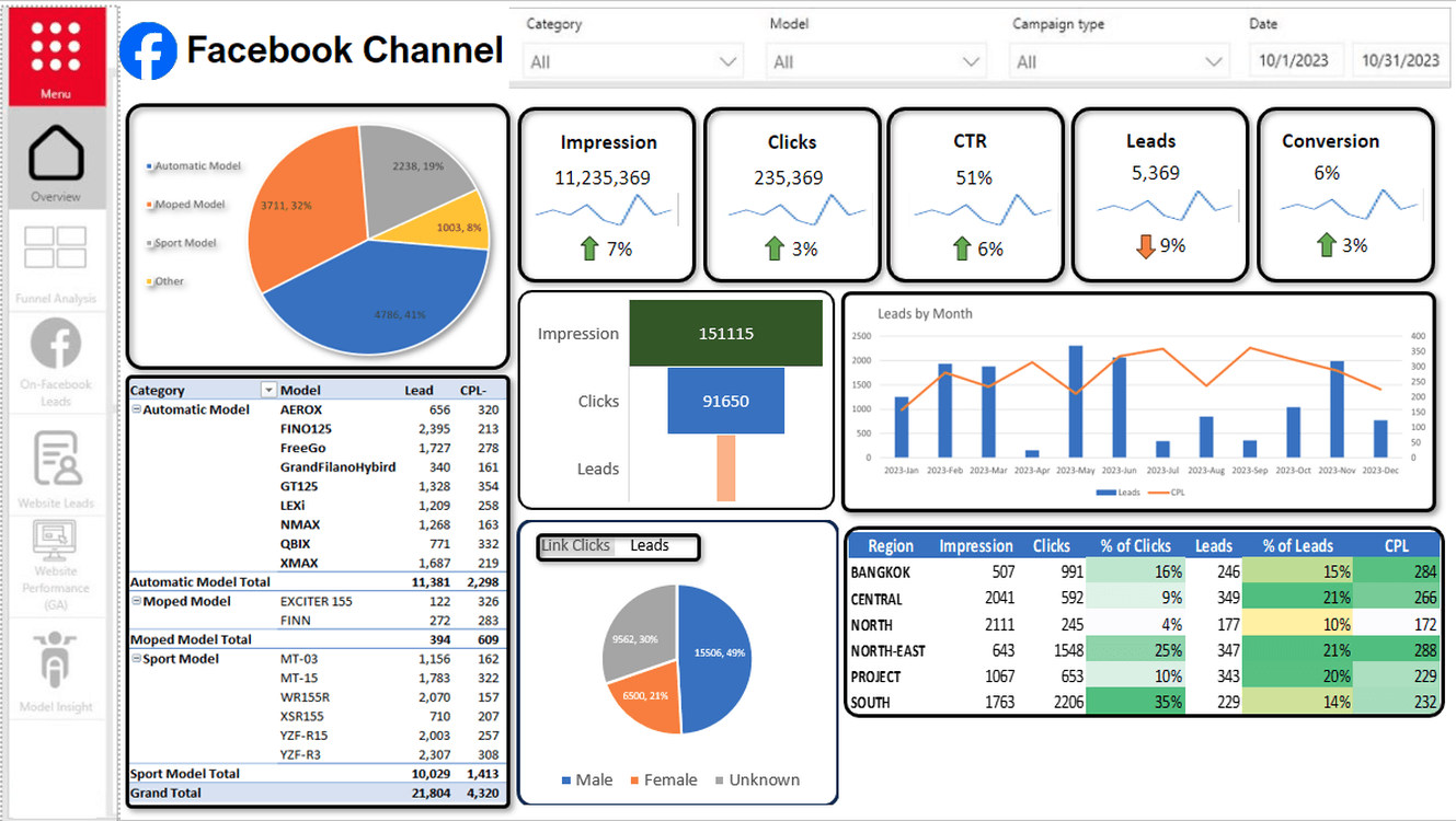
Guided Analytics: Create dashboard paths that tell stories sequentially, guiding executives through logical analysis flows.
What-If Modeling: Enable executives to adjust variables and see how stories change, supporting scenario planning and decision modeling.
Contextual Annotations: Add explanatory notes that appear when executives hover over or click on specific data points.
Integration with Decision Support Systems
Workflow Integration: Connect dashboards to approval systems, allowing executives to act on recommendations directly within the analytics interface.
Meeting Support: Generate narrative summaries optimized for board presentations or executive briefings.
Alert Systems: Create narrative-driven alerts that explain not just what happened, but why it matters and what actions to consider.
Measuring Narrative Dashboard Success
Executive Engagement Metrics
Time to Decision: Measure how quickly executives can make informed decisions using your dashboards versus traditional approaches.
Dashboard Usage Patterns: Track which narrative elements generate the most engagement and drive actual business decisions.
Decision Quality Outcomes: Monitor whether dashboard-informed decisions create better business results than intuition-based choices.
Trust and Adoption Indicators
Voluntary Usage: Executives who trust their dashboards use them voluntarily, not just during required meetings.
Recommendation Follow-Through: Track how often executives implement dashboard-generated recommendations.
Internal Advocacy: Measure how often executives reference dashboard insights in communications with other leaders.
Industry-Specific Narrative Applications
Manufacturing: The Operations Story
Transform equipment data into operational narratives focusing on production efficiency, quality trends, and maintenance optimization. Frame metrics within supply chain contexts and market demand patterns.
Healthcare: The Patient Journey Narrative
Convert clinical and operational metrics into patient experience stories, showing how administrative decisions impact care quality and organizational sustainability.
Financial Services: The Risk and Opportunity Narrative
Present market data within risk/reward narratives that help executives balance growth opportunities against regulatory compliance and risk management requirements.
Technology: The Innovation and Scale Story
Frame user adoption, system performance, and development metrics within product evolution narratives that guide feature prioritization and technical debt management.
Common Implementation Pitfalls
The Netflix Trap
Trying to create documentary-quality narratives rather than decision-focused business stories. Executive dashboards need clarity and actionability, not entertainment value.
The Novelist’s Mistake
Including too much narrative detail, overwhelming the data visualization. Balance is crucial—enough story to provide context, not so much that it obscures insights.
The Academic Error
Presenting every analytical finding rather than focusing on actionable business insights. Academic rigor doesn’t equal executive utility.
The Technical Translation Failure
Using technical metrics language in business narratives. Revenue Recognition Rate means nothing to most executives; “Subscription Revenue Predictability” tells a clearer story.
Advanced Narrative Techniques
Comparative Storytelling
Present your business performance within competitive or industry contexts. “While industry revenue declined 12%, our 8% decrease represents market share gains” tells a very different story than simple revenue reporting.
Temporal Narrative Layering
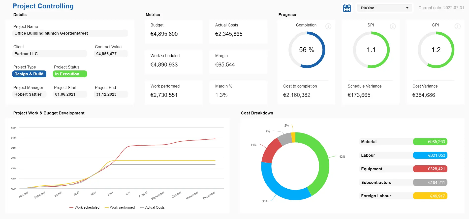
Connect current metrics to historical patterns and future projections within single narrative flows. Help executives understand whether current performance represents temporary fluctuations or fundamental business changes.
Multi-Stakeholder Perspective Integration
Present the same metrics from different stakeholder viewpoints (customer, employee, shareholder, regulator) to provide comprehensive business context for executive decision-making.
Causal Chain Narratives
Show how upstream decisions and external events create downstream metric changes. Help executives understand root causes rather than just observing symptoms.
Building Your Implementation Roadmap
Phase 1: Narrative Assessment (Week 1-2)
Evaluate your current dashboards against narrative principles. Identify which metrics tell business stories and which simply report numbers.
Phase 2: Story Architecture Design (Week 3-4)
Map your key business decisions to supporting data stories. Design narrative frameworks for your most critical executive decision points.
Phase 3: Pilot Implementation (Week 5-8)
Implement narrative dashboards for one key business area. Test executive engagement and decision-making improvements.
Phase 4: Feedback Integration (Week 9-10)
Gather executive feedback on narrative effectiveness and decision utility. Refine approaches based on actual usage patterns.
Phase 5: Scaling Strategy (Week 11-12)
Expand successful narrative approaches to additional business areas. Develop organization-wide narrative dashboard standards.
The Competitive Intelligence Advantage
Organizations using narrative-driven dashboards gain significant competitive advantages:
Decision Speed: 60% faster decision-making on critical business issues Decision Quality: 40% improvement in decision outcome success rates
Executive Engagement: 85% increase in voluntary dashboard usage Strategic Alignment: 50% better alignment between tactical decisions and strategic objectives
Looking Forward: The Future of Executive Analytics
The evolution toward narrative-driven dashboards represents a fundamental shift from data reporting to decision support. Organizations that master this transition will dominate their markets through superior decision-making speed and quality.
Emerging Trends to Watch:
AI-Powered Business Storytelling: Advanced algorithms that understand your business context and generate industry-specific narratives automatically.
Conversational Analytics: Executive dashboards that respond to spoken questions and provide narrative answers, making analytics as natural as business conversations.
Predictive Narrative Modeling: Systems that don’t just show what happened, but tell stories about what’s likely to happen under different scenarios.
Collaborative Decision Frameworks: Dashboards that facilitate multi-executive decision-making through shared narrative understanding and structured choice architectures.
Taking Action: Your Next Steps
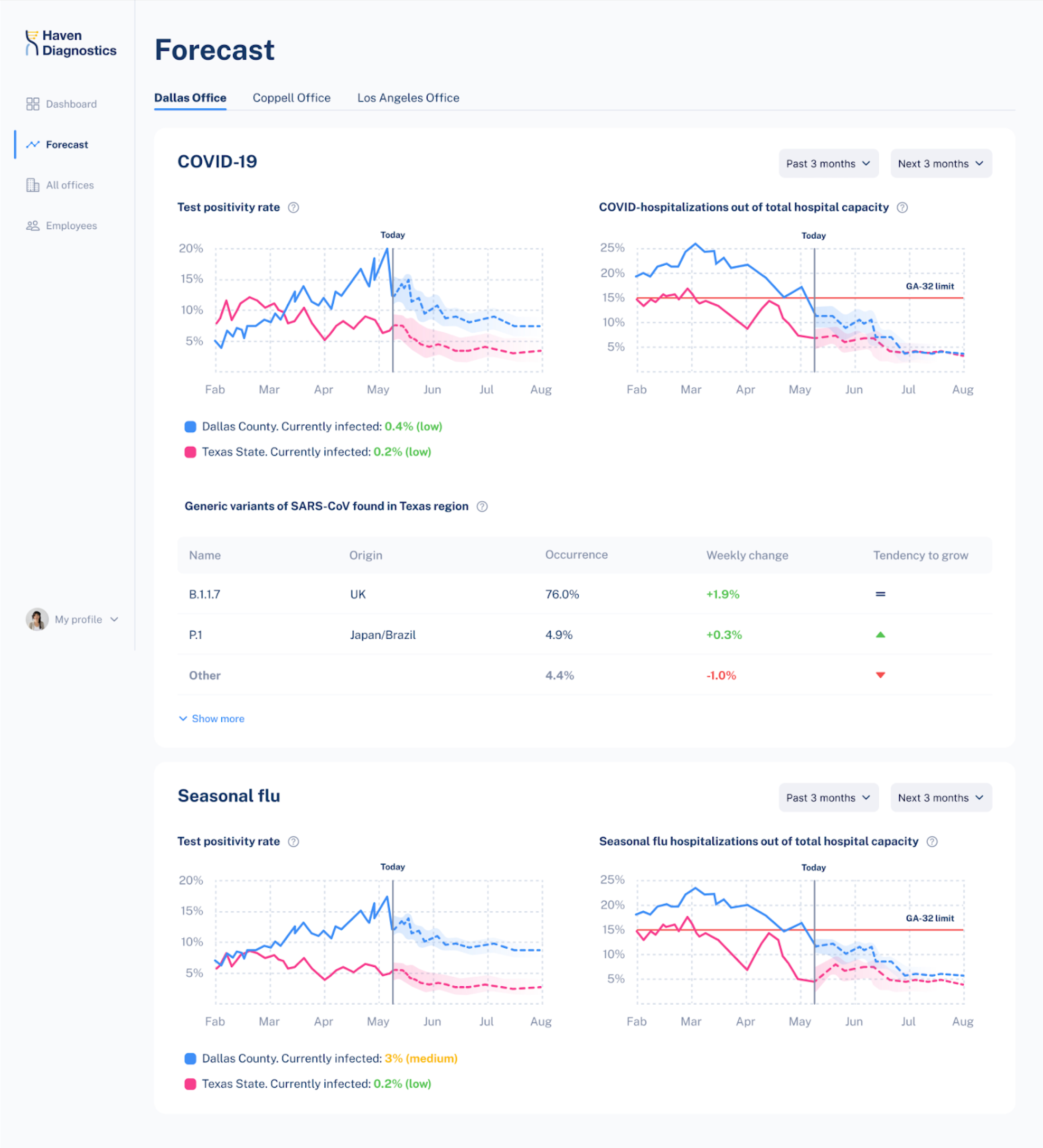
The shift from data dashboards to narrative-driven decision support isn’t optional—it’s inevitable. The executives and organizations that make this transition first will capture disproportionate competitive advantages.
Start with one critical business decision your organization faces regularly. Apply the STORY framework to transform how you present supporting analytics. Measure the impact on decision speed and quality.
Your stakeholders—board members, investors, employees—are waiting for leaders who can translate data complexity into business clarity. Narrative-driven dashboards provide that translation capability.
The question isn’t whether narrative-driven analytics will transform executive decision-making in your organization. The question is whether you’ll lead that transformation or follow it.
The most successful executives of the next decade won’t be those who can analyze the most data—they’ll be those who can extract the most actionable stories from the information they have.
Your competition is already learning to tell better stories with their data. The time to master narrative-driven dashboards is now.
Frequently Asked Questions
Q: How do narrative dashboards differ from traditional executive reporting? A: Traditional dashboards show what happened; narrative dashboards explain why it matters and what to do about it. They provide context, implications, and recommendations rather than just metrics and charts.
Q: Can narrative dashboards work for technical teams, or are they only for executives? A: While designed for executive decision-making, narrative principles improve any dashboard’s effectiveness. Technical teams benefit from contextual information and clear action implications just as executives do.
Q: How do you balance narrative storytelling with analytical rigor? A: Effective narrative dashboards use rigorous analytics as their foundation but present findings within business context that drives action. The story emerges from solid data analysis, not creative interpretation.
Q: What’s the typical ROI timeline for implementing narrative-driven dashboards? A: Most organizations see improved decision-making speed within 30 days and measurable decision quality improvements within 90 days. Full ROI typically materializes within 6-12 months through better strategic choices.
Q: How do you prevent narrative dashboards from becoming too subjective? A: Establish clear frameworks for narrative generation, use automated systems where possible, and regularly validate story accuracy against business outcomes. Subjectivity becomes problematic when narratives aren’t grounded in solid data analysis.
Q: Can narrative dashboards integrate with existing BI tools? A: Yes. Most modern BI platforms support narrative elements through custom visualizations, natural language generation features, and annotation capabilities. The key is design approach, not necessarily new technology.
Q: How do you train executives to use narrative dashboards effectively? A: Focus on business outcomes rather than technical features. Show how narrative dashboards improve their existing decision-making processes instead of requiring new analytical skills.
Ready to transform your organization’s decision-making with narrative-driven dashboards? At Pivot BI Analytics LLC, we specialize in converting traditional executive reporting into decision-driving narrative systems. Our STORY framework has helped 200+ organizations improve executive decision-making speed by 60% while increasing decision quality outcomes by 40%.
Contact us today for a complimentary Executive Dashboard Assessment to discover how narrative-driven analytics can accelerate your organization’s most critical business decisions.
This transformation from data reporting to business storytelling isn’t just about better dashboards—it’s about creating competitive advantages through superior decision-making capabilities. The executives who master narrative-driven analytics will lead the organizations that dominate their markets.
The story of your organization’s success is waiting to be told through your data. The question is: will you be the author of that story, or will your competitors write it for you?
